Set up React components package
/ 3 min read
Table of Contents
Summary
In this post I will show you how we can build react components package
Getting started
Setting dependencies
Solution
- Go to working directory & Init project
cd ~/ && mkdir hugo-rcnpm init -yyarn add react react-dom classnamesyarn add -D typescript tailwindcss postcss autoprefixernpx sb initAdd tsconfig.json
npx tsc --init{ "compilerOptions": { "target": "es5", "jsx": "react-jsx", "module": "commonjs", "rootDir": "./src", "declaration": true, "outDir": "./dist", "removeComments": true, "esModuleInterop": true, "forceConsistentCasingInFileNames": true, "strict": true, "skipLibCheck": true }, "include": ["src"], "exclude": ["**/*.spec.{tsx,ts}", "**/*.stories.{tsx,mdx}", "node_modules"]}Add tailwind.css
@tailwind base;@tailwind components;@tailwind utilities;Update scripts
"scripts": { "storybook": "start-storybook -p 6006", "build-storybook": "build-storybook", "prebuild": "rm -rf dist", "build": "npm run build:css && tsc", "prebuild:css": "rm -rf tailwind.generated.css", "build:css": "tailwindcss -i tailwind.css -o tailwind.generated.css"}Build tailwind.generated.css
yarn build:cssimport css to storybook
import '../tailwind.generated.css';
export const parameters = { actions: { argTypesRegex: '^on[A-Z].*' }, controls: { matchers: { color: /(background|color)$/i, date: /Date$/, }, },};- Write react components
import React, { forwardRef, ComponentPropsWithoutRef } from 'react';import cn from 'classnames';import { Spinner } from './Spinner';
export interface IButtonProps extends ComponentPropsWithoutRef<'button'> {  className?: string;  variant?: 'primary' | 'outline' | 'error';  isLoading?: boolean;  disabled?: boolean;  onClick?: () => void;}
export const Button = forwardRef<HTMLButtonElement, IButtonProps>( ( { className, variant = 'primary', isLoading = false, disabled = false, onClick, children, }: IButtonProps, ref ) => { return ( <button className={cn( 'rounded-lg px-5 py-3 font-bold flex items-center justify-center focus:outline-none transition ease-in-out duration-150', disabled ? 'cursor-not-allowed bg-gray-500 hover:bg-gray-500 text-white' : [ variant === 'error' && 'bg-red-500 hover:bg-red-600 text-white border-white', variant === 'outline' && 'bg-white text-blue-500 border border-blue-500', variant === 'primary' && 'bg-blue-500 hover:bg-blue-600 text-white border-white', ], className )} onClick={onClick} disabled={disabled} type="button" ref={ref} > {isLoading ? ( <Spinner className={ variant === 'outline' ? 'border-blue-500' : 'border-white' } /> ) : ( <>{children}</> )} </button> ); });- write storybook
import React from 'react';import { ComponentStory } from '@storybook/react';import { Button } from './Button';
export default {  title: 'Button',  component: Button,};
const Template: ComponentStory<typeof Button> = (args: any) => (  <Button {...args}>{args.children}</Button>);
export const PrimaryButton = Template.bind({});PrimaryButton.args = {  variant: 'primary',  isLoading: false,  disabled: false,  onClick: () => {    console.log('click primary button');  },  children: 'PRIMARY',};
export const OutlineButton = Template.bind({});OutlineButton.args = {  variant: 'outline',  isLoading: false,  disabled: false,  children: 'OUTLINE',};
export const ErrorButton = Template.bind({});ErrorButton.args = {  variant: 'error',  isLoading: false,  disabled: false,  children: 'ERROR',};
export const LoadingButton = Template.bind({});LoadingButton.args = {  variant: 'primary',  isLoading: true,  disabled: false,  children: 'LOADING',};
export const DisabledButton = Template.bind({});DisabledButton.args = { variant: 'primary', disabled: true, isLoading: false, onClick: () => { console.log('click disabled button'); }, children: 'DISABLED',};- Preview storybook
yarn storybook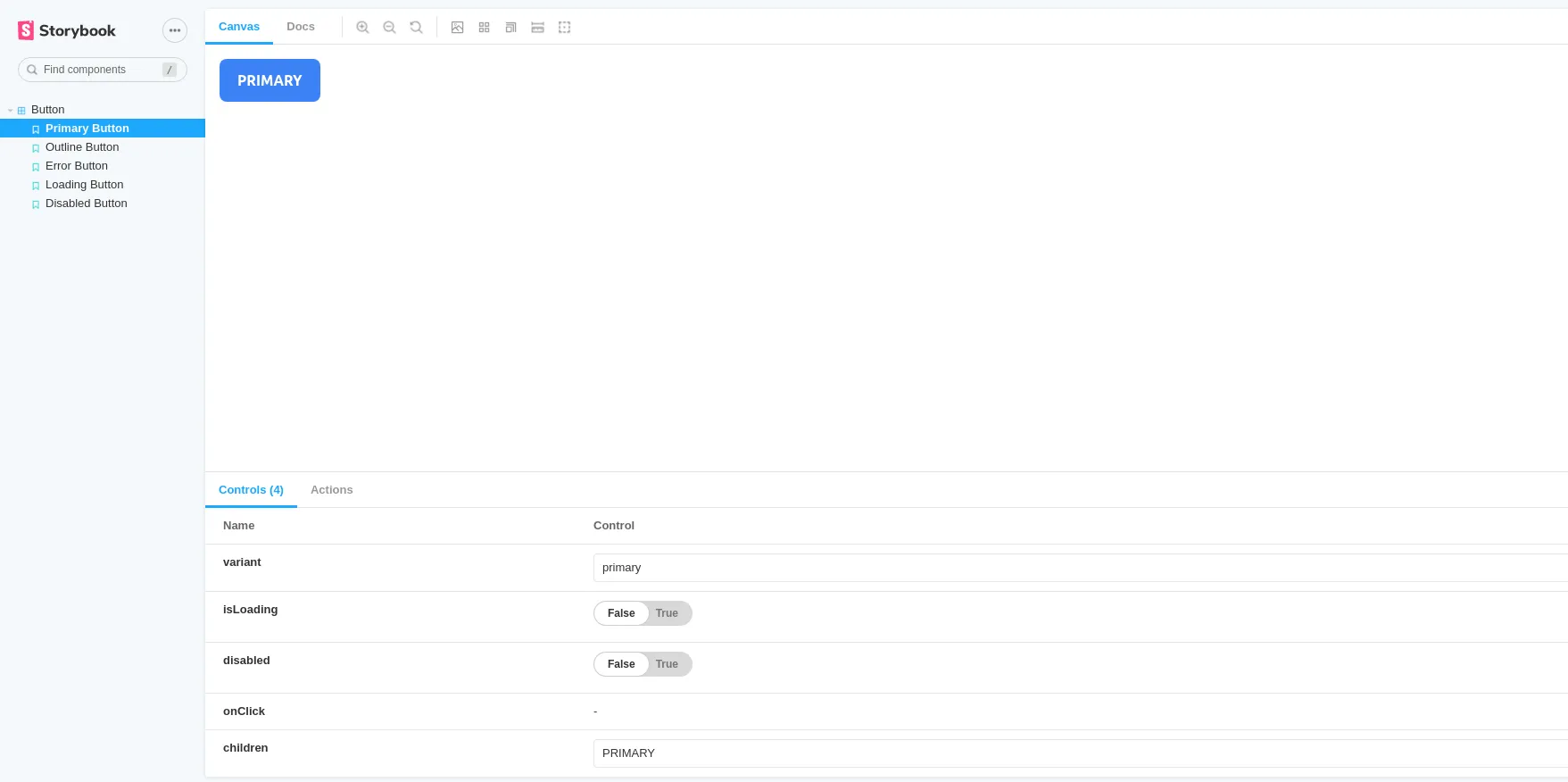
- Setting to publish package
add .npmignore
package.jsonsrctsconfig.jsondist- Run command to publish
npm publish- Deploy to netlify
Preview site